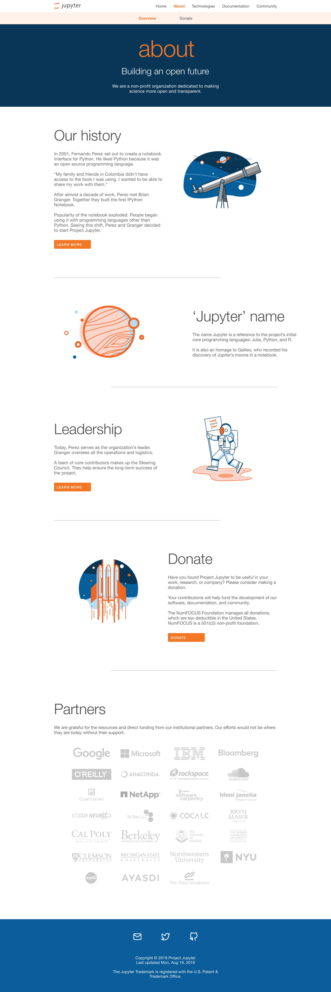
Jupyter.org
Jupyter.org aims to guide and inform individuals, organizations, contributors, and sponsors about Project Jupyter’s core values, technology, and community.
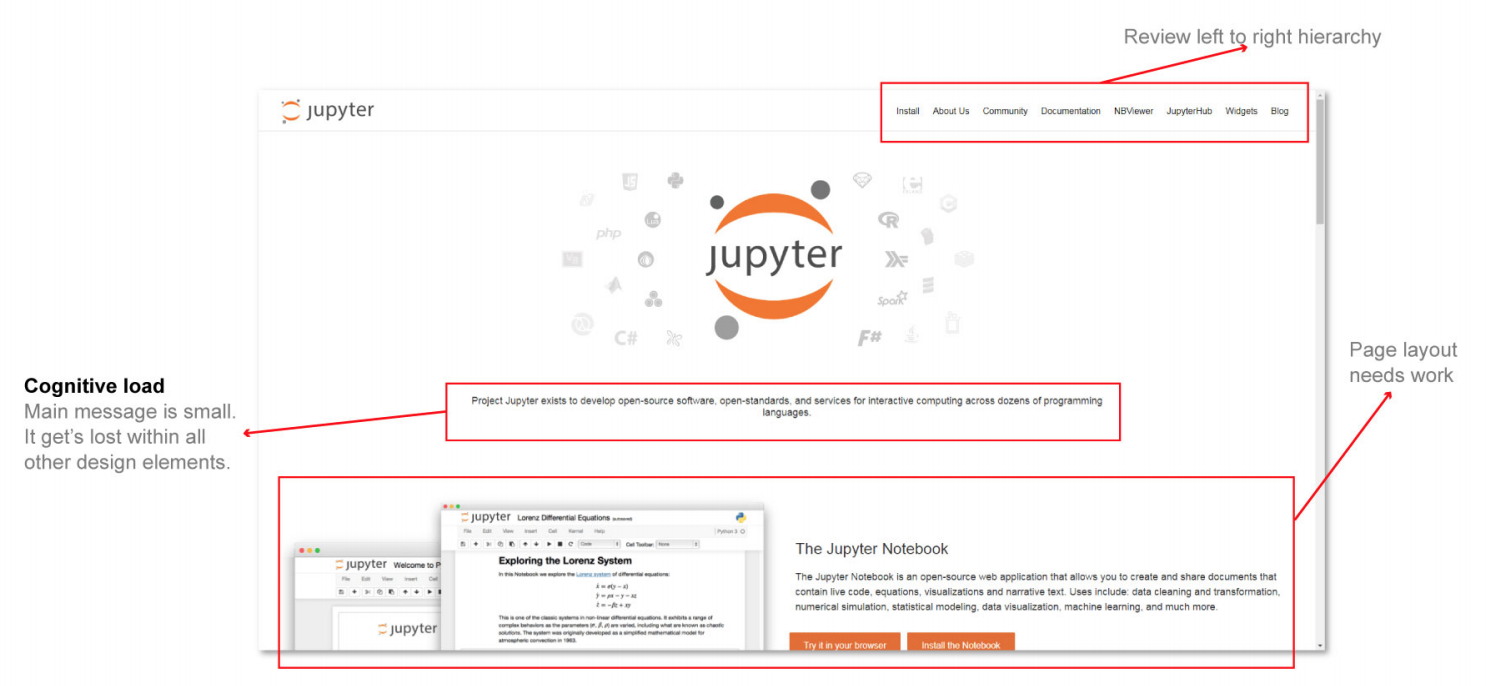
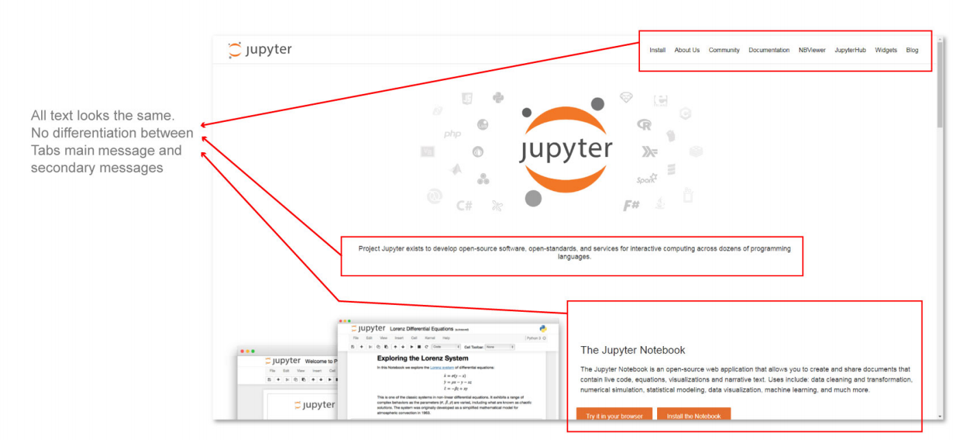
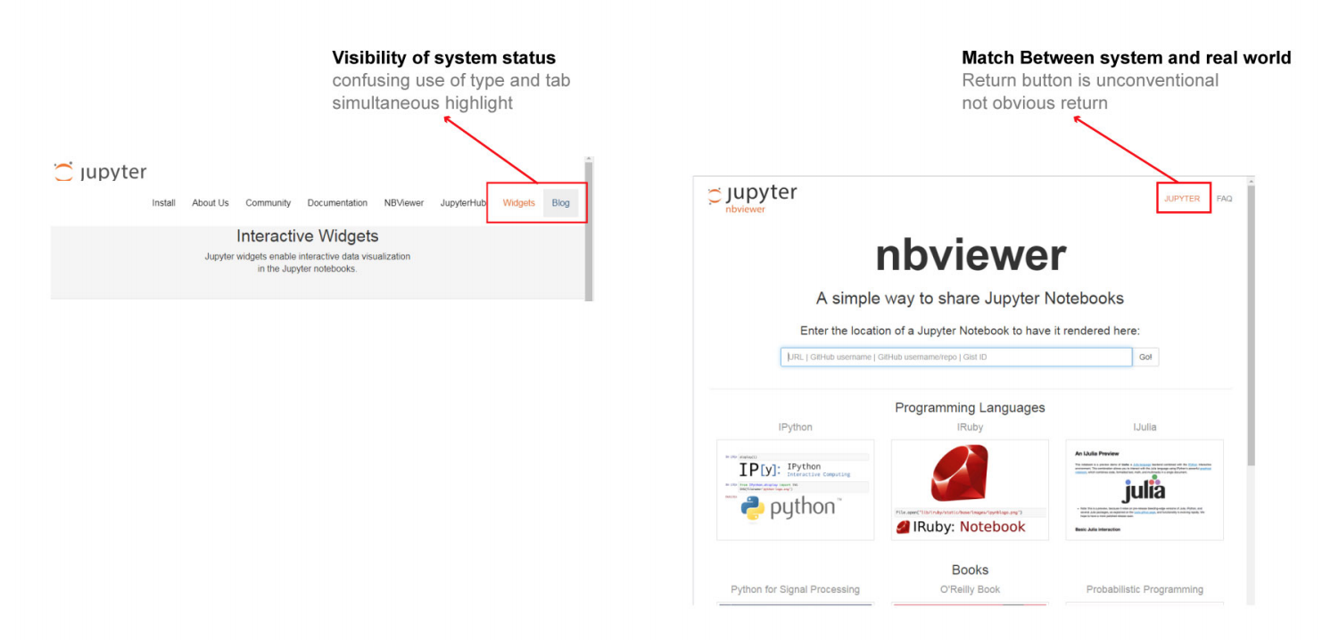
The current website does not effectively communicate this information to these parties. This problem calls for a complete website re-design.
UX principles will be used to analyze the issues with the experience and how it could be improved.
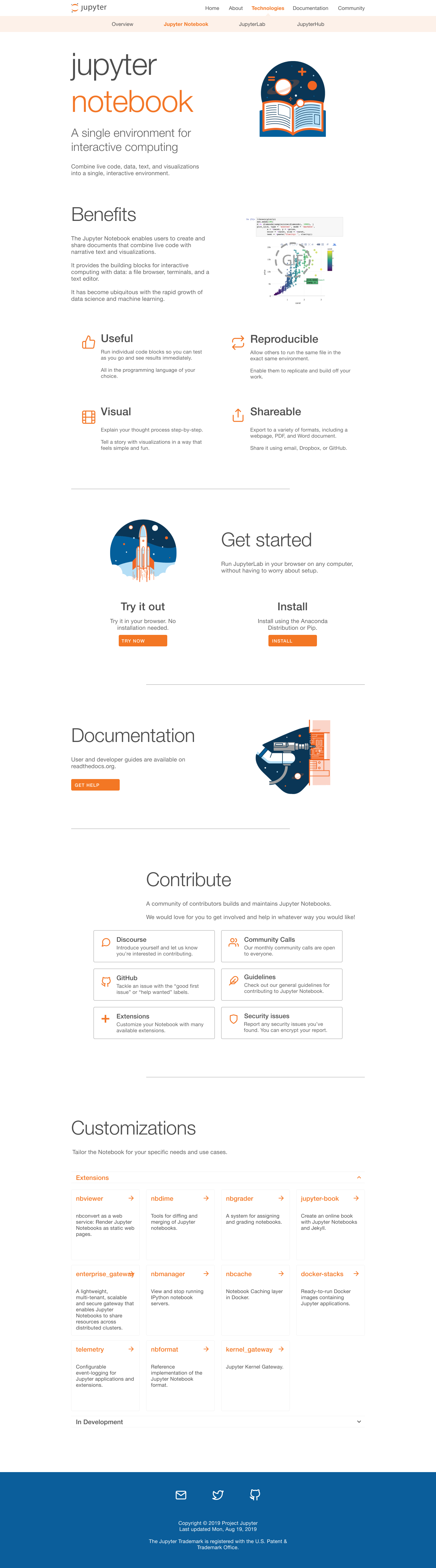
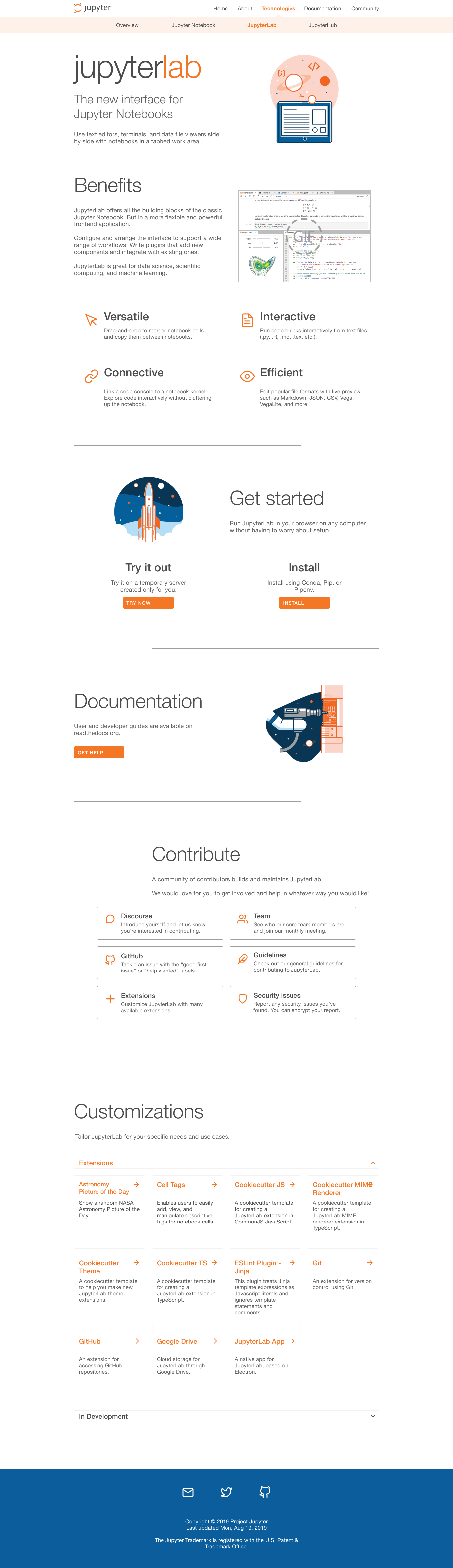
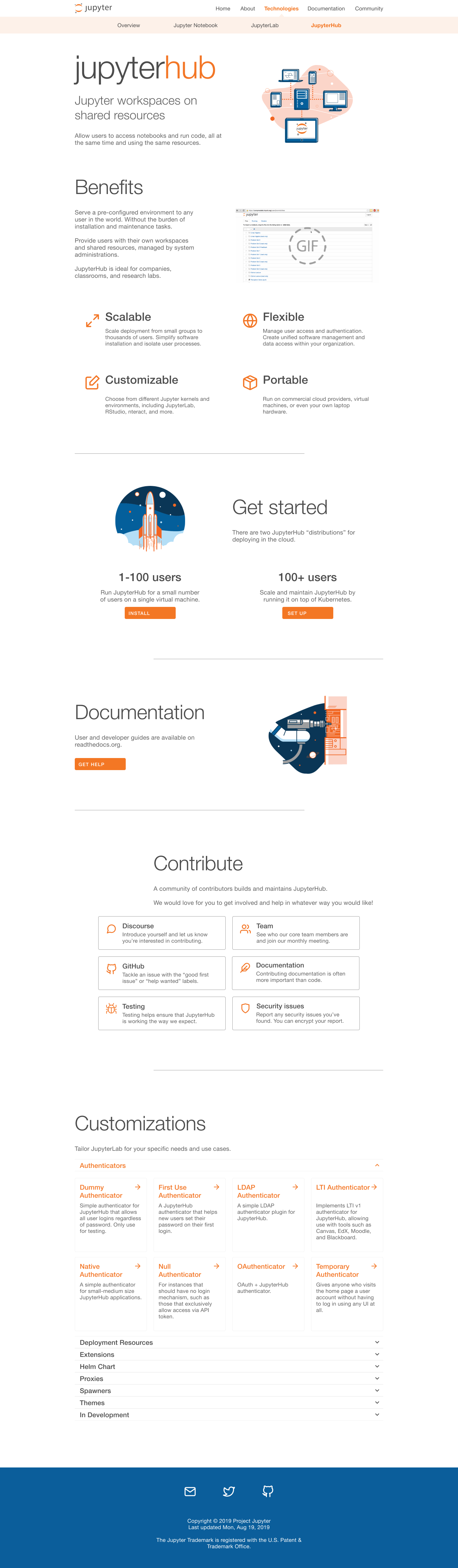
What is Jupyter?
![]() Jupyter software is a suite of free tools designed for interactive and reproducible computing. It consists of three major layers: kernel, middle ware, and application. Each layer is interchangeable.
Jupyter software is a suite of free tools designed for interactive and reproducible computing. It consists of three major layers: kernel, middle ware, and application. Each layer is interchangeable.
These tools can support interactive computing and data analysis across any programming language. Users around the world have used them for various purposes such as academia, research, industry, and journalism.
Heuristic Evaluation
Jupyter.org Strengths
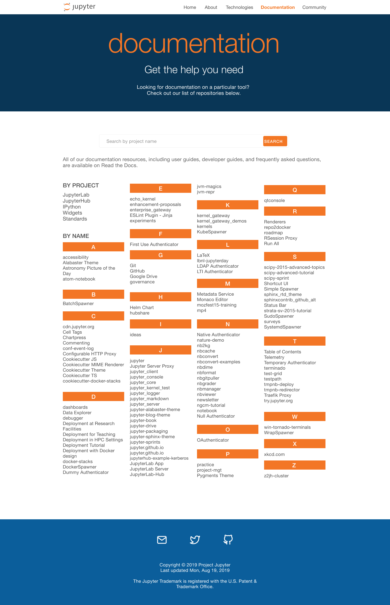
- Useful and detailed information
- Establishes credibility
- Flexibility and ease-of-use
- User feedback
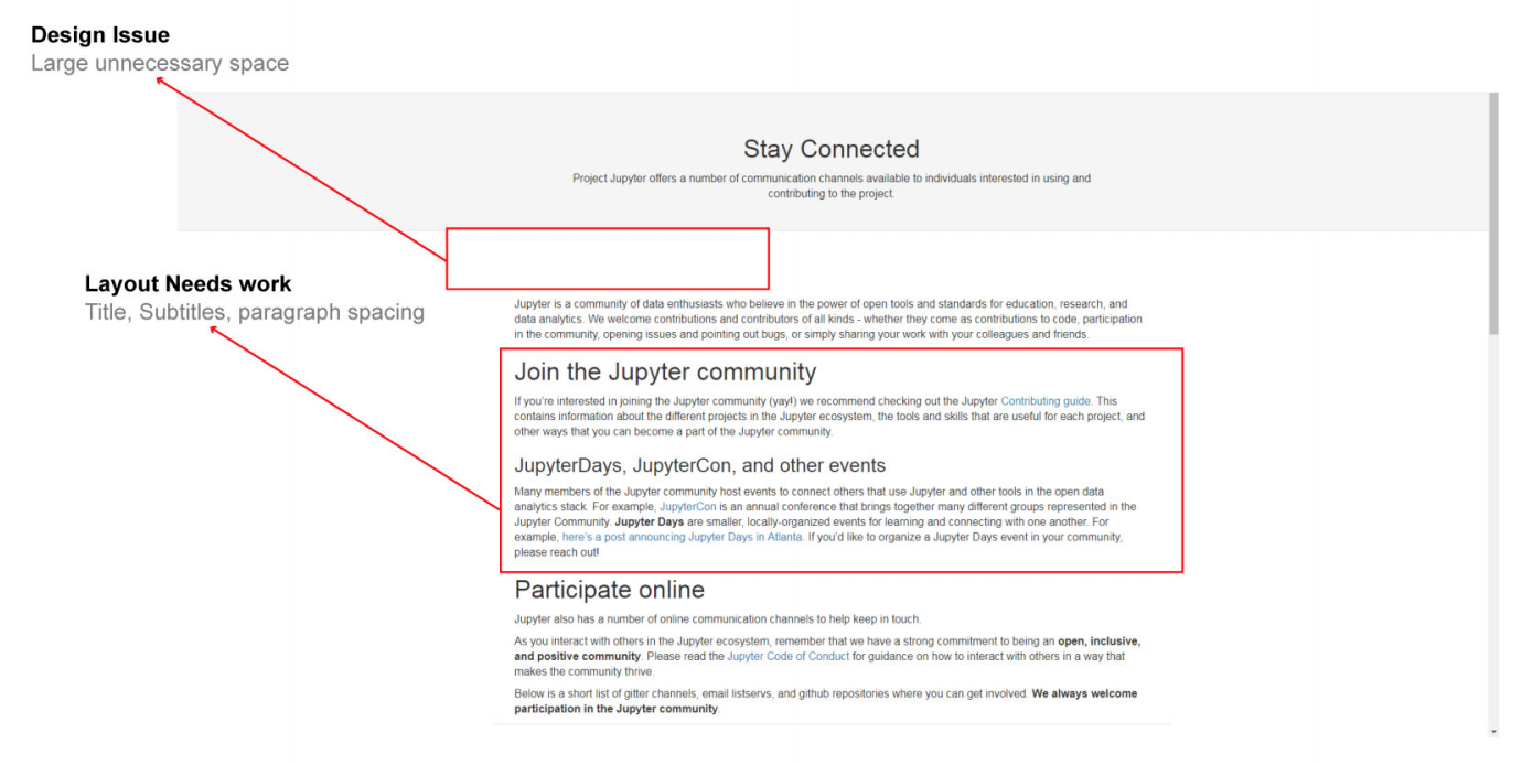
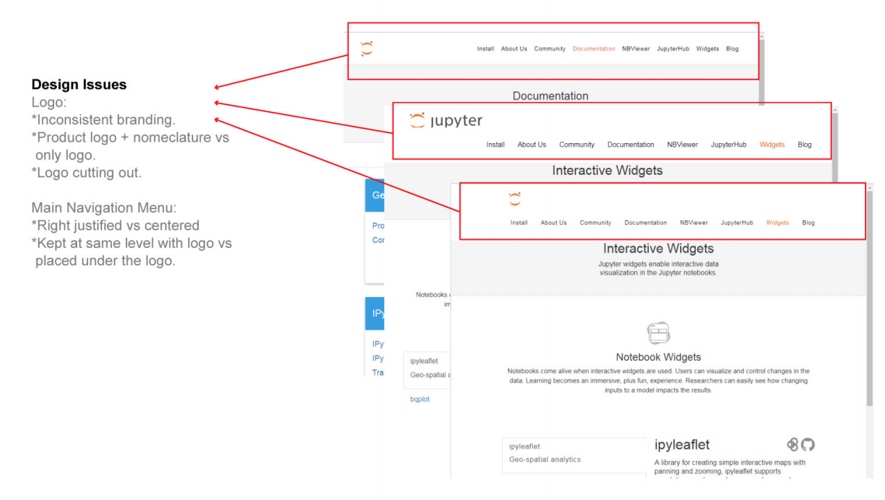
Jupyter.org Weaknesses
- Multiple bugs
- Design inconsistencies
- Missing calls-to-action
- Text-heavy content
Competitive Analysis
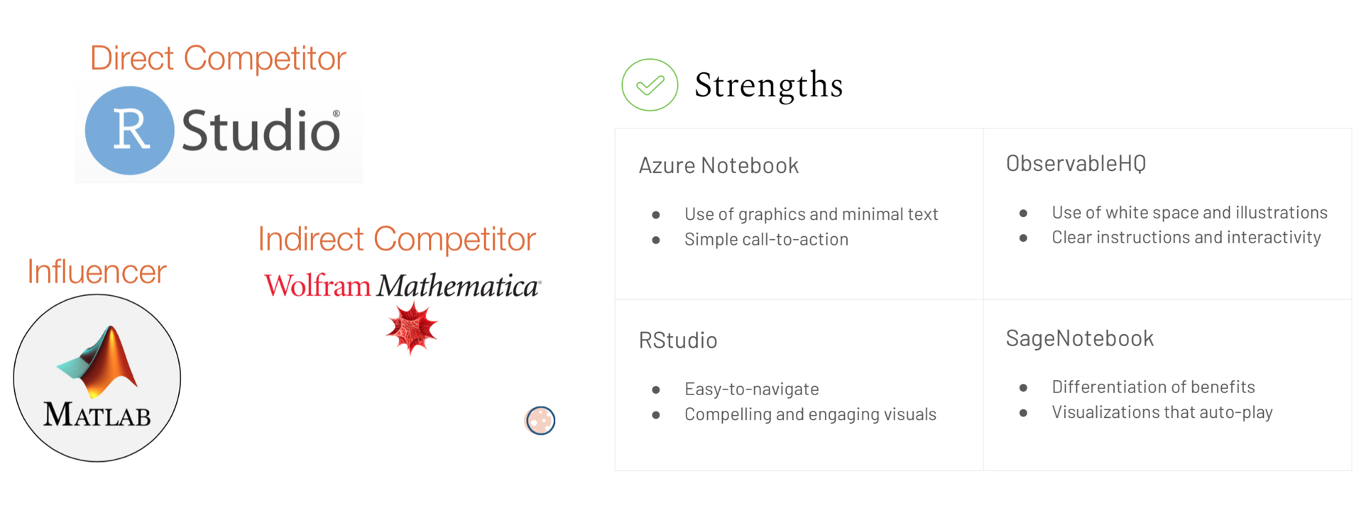 In contrast to Jupyter, their competitors have the advantage of being for-profit and employing vast development teams, so while Jupyter’s user base is significantly larger, competitors had much more effective websites. Detailed analysis of these sites brought substantial insight into our own designs and helped us understand what works well in this market’s environment.
Interviews
 Members of this community share Jupyter’s mission values with pride, thus caring deeply for its success. Jupyter’s technical merit is abundantly clear, so our challenge here is to capture the social and emotional appeal on the website.
Affinity Diagrams
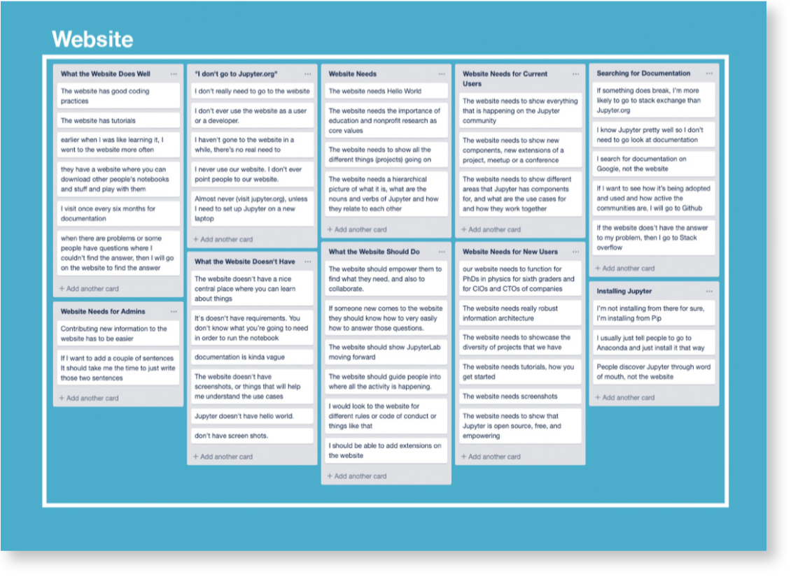
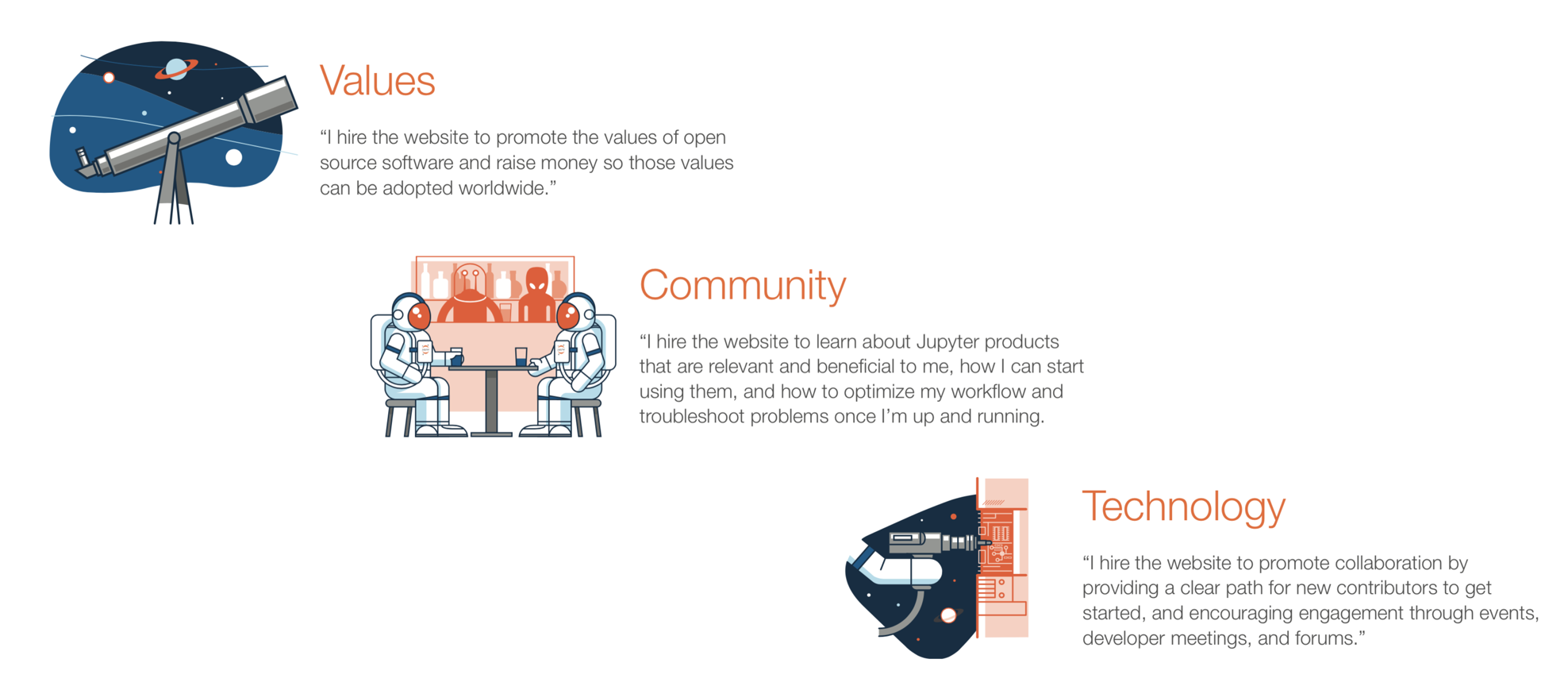
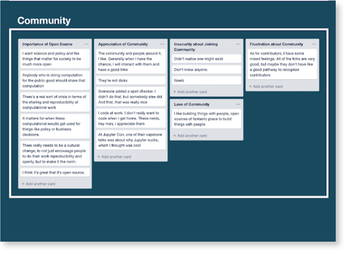 Affinity diagrams are used to organize data into groupings based on their natural relationships. We created two using insights gathered from our surveys and in-depth interviews with Jupyter users, non-users, contributors, and community members. The diagrams later helped us construct jobs-to-be-done and archetypes.
The insights around functional motivations were sorted into the following categories:
- Defining Jupyter
- Reputation
- Open Source
- Benefits
- Pain Points
- Community
- Usage
- Website
Archetypes
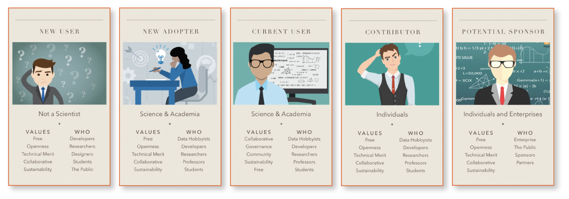 These archetypes embody various different backgrounds and needs of potential visitors to Jupyter.org.
Cognitive Walkthrough
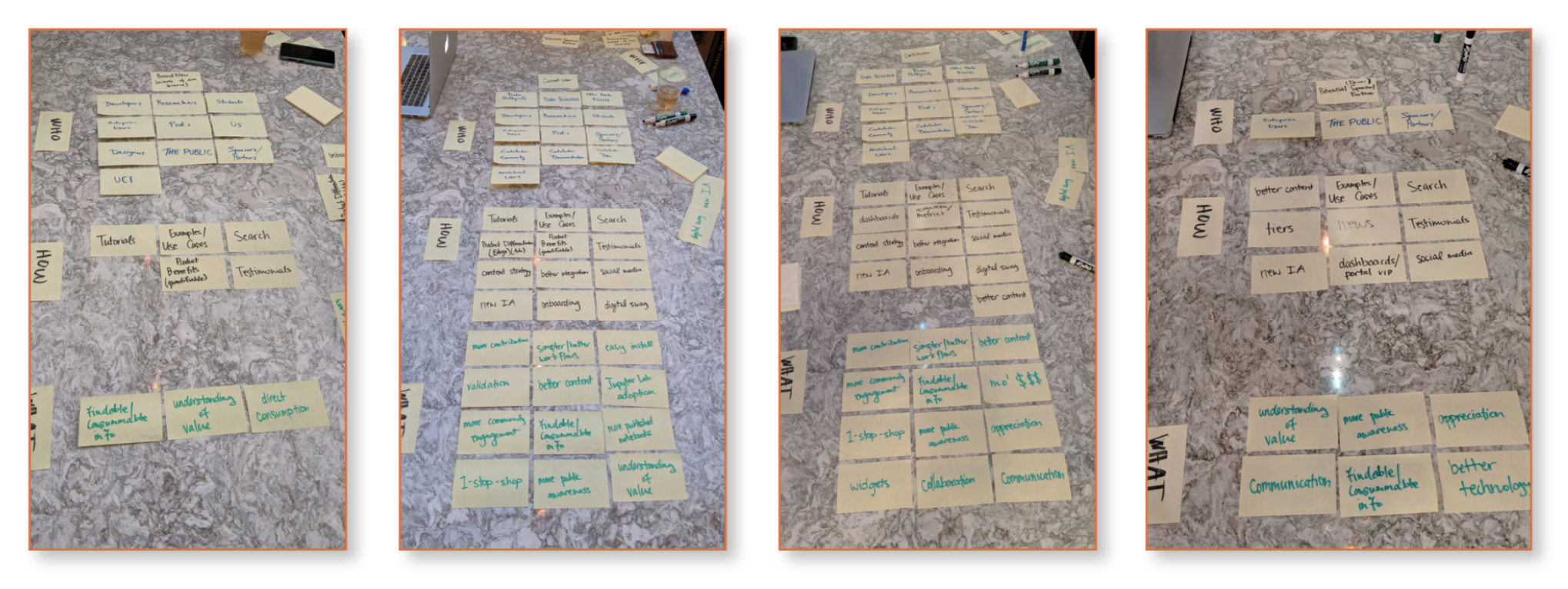 We used cognitive walkthroughs to aid our understanding of the site’s information architecture, user journey flows, and navigation pain points.
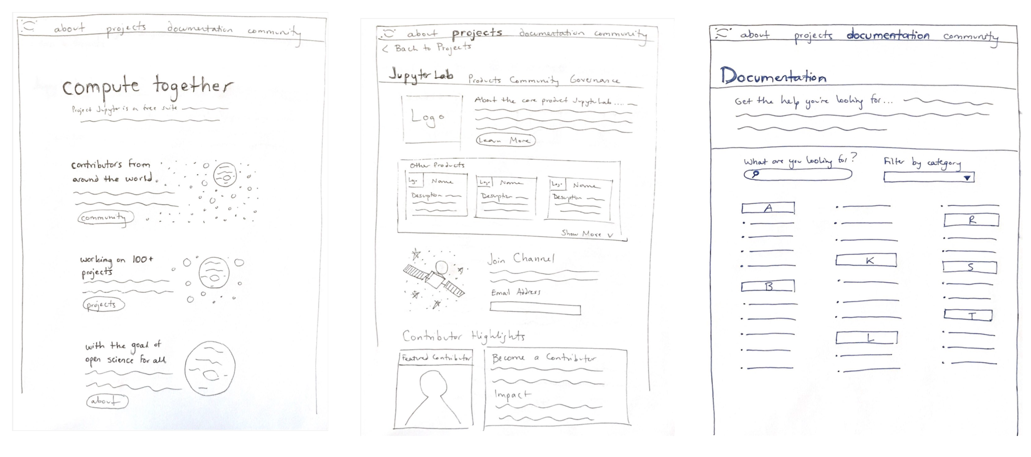
Sketches
Mockups
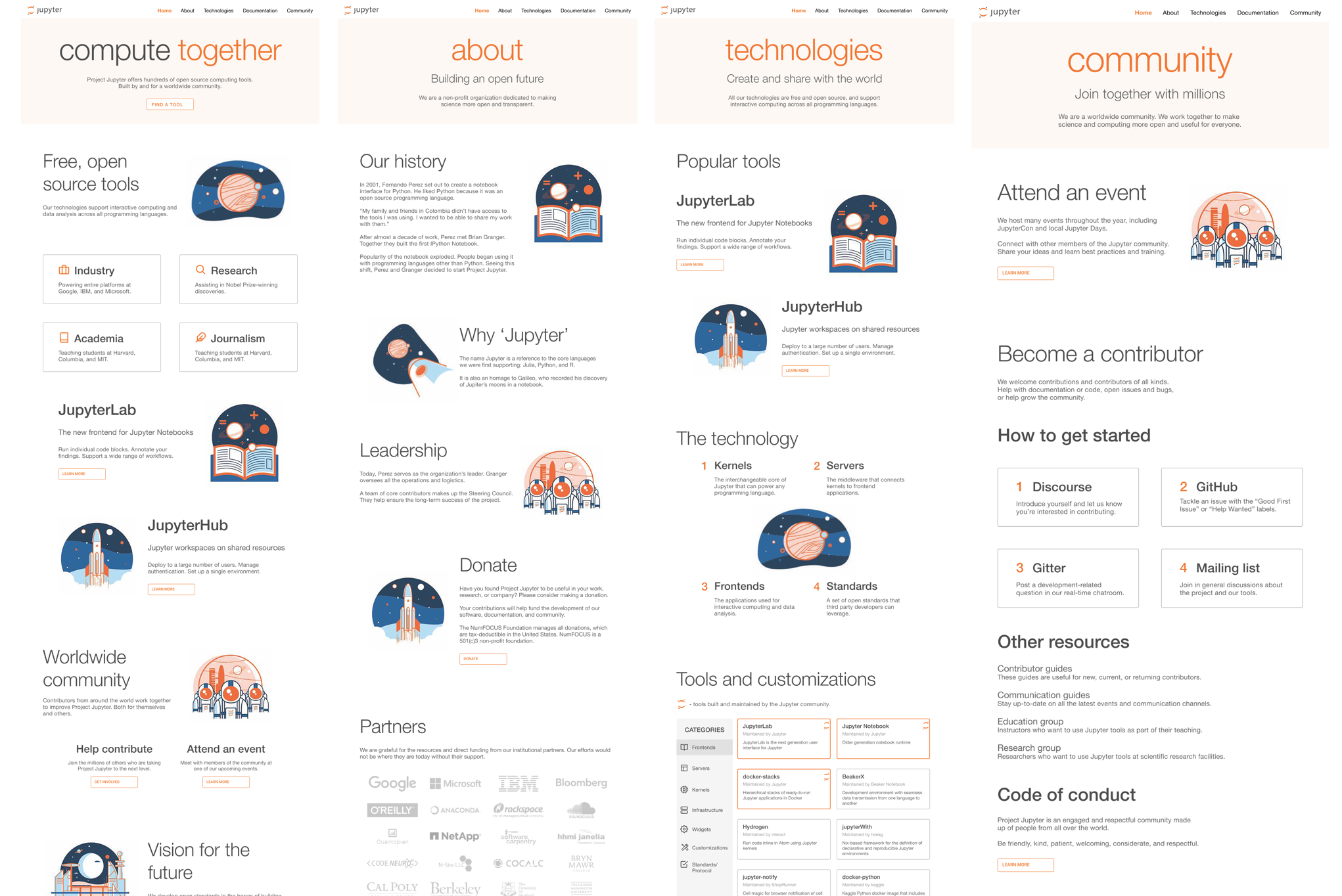 For the initial mockups, we used Validately.com to conduct remote and unmoderated user testing. Our goal was to see whether those who are unfamiliar with the website could intuitively navigate the website based on the information architecture and hierarchy. We discovered that the emphasis on individual comunities was far too confusing and thus had to reconsider the information architecture.
Design System
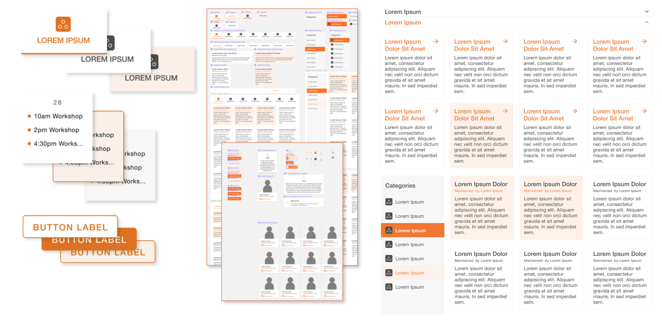 In congruence with client needs and further evangelizing the benefits of open-source, we decided to move forward utilizing Google’s established Material Design as the foundation for our design system.
By customizing this open-source library of design components, we enabled a depth of branding without having to leverage the tested, flexible, and accessible aspects Material Design has to offer. This held substantial benefits for development as well, freeing a majority of development time that would have otherwise been spent on recreating custom components and their nuanced functionality from scratch.
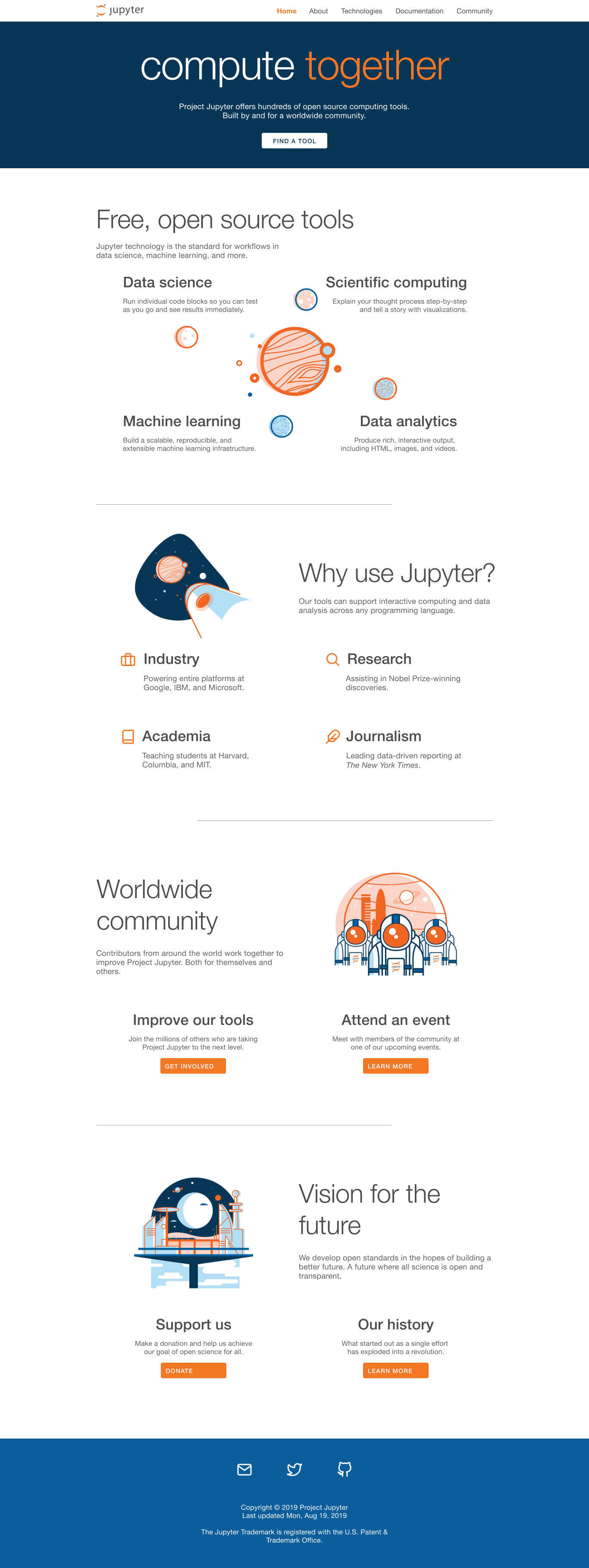
High-Fidelity Prototype
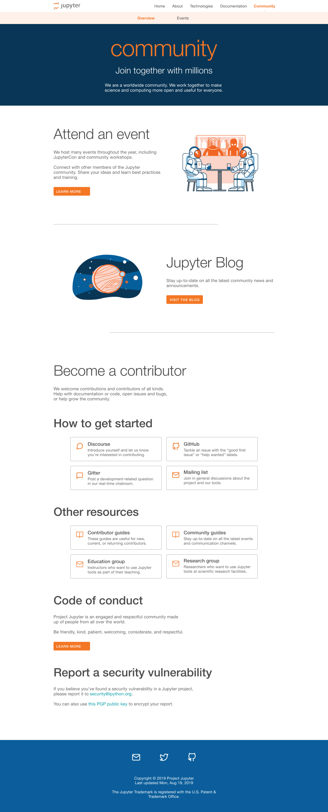
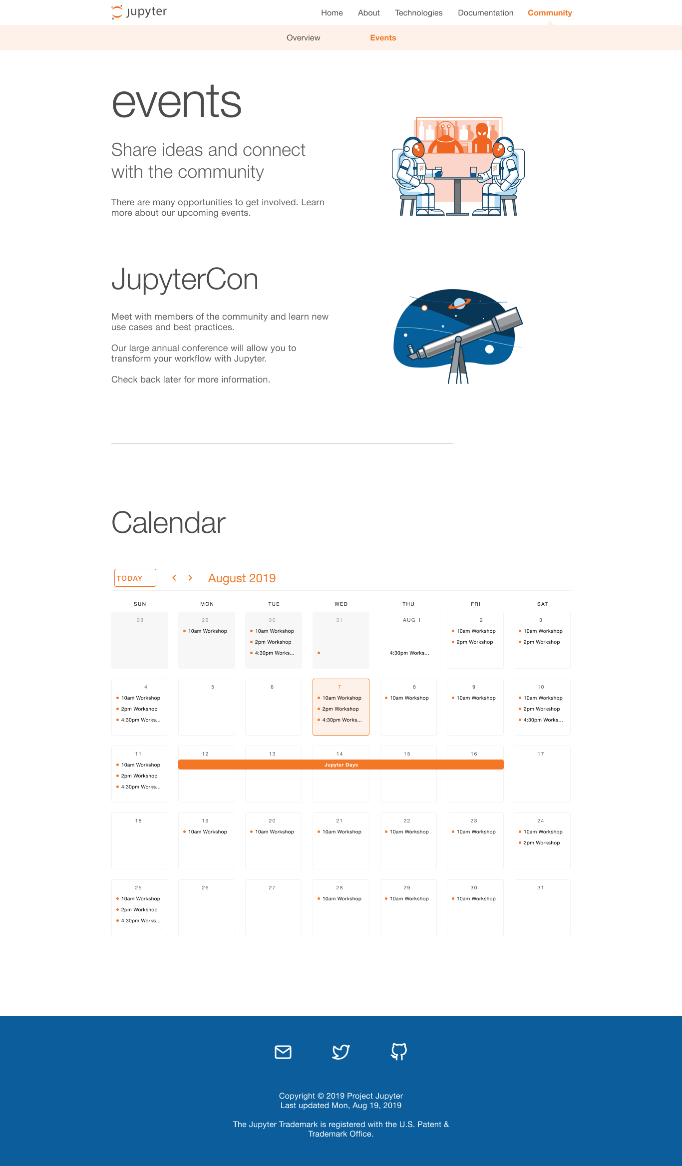
After several rounds of usability tests and collaboration with the community, we were able to create a high fidelity prototype that was user-friendly, accessible, and scalable. We improved content discoverability for users both new and current by building a website filled with engaging content, an organized sitemap, and a dynamic pivot table.
Daniel is a UX Designer based in Oakland. Currently at Johnson & Johnson. Formerly at Intuitive.